Tips About T-shirt Printing in Brisbane

T-shirt Printing
T-Shirt Printing
Sometimes there are reasons for you to make a custom t-shirt for a special occasion. This occasion could be simple as a birthday party, an advertisement, or even just for fun. It could be for something elaborate such as a family reunion or company picnic.
You could go for something straight off the shelf for these t-shirts. You could also design your own t shirt so that you get exactly what you want. This is the way to go if you want something unique and special.
This article will give you some tips on printing your own t-shirts so that you won’t make any mistakes. You want your customized shirts to be just what you were dreaming of. You could also do some more research to find even more tips.

Tips on Printing Your Own T-Shirt Design
1.Modest Size Design – Your image should be a modest size – not too big and not too small. Most people want to do the standard size, which could just be too big for the look you are wanting to go for. You don’t want an image that overtakes the size of your shirt.
Some designs such as a circle or square don’t look as good if you go with the standard size. You need to consider the entire size of the image, and not just the width and height. This will help you to get the size right on the t-shirt.
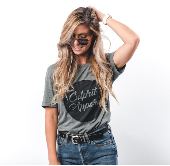
2.Placement Matters – This is different than the print location – it is the print placement. The print should be about four inches below the collar:https://www.youtube.com/watch?v=USBAQ6ulrmE. You don’t want to have the image in the middle of your belly.
The placement of the design shouldn’t be too high or too low – unless you have a specific reason for it to be in these places. Just be careful if you don’t want to have standard placement – it could make the shirt look out of the ordinary. If this is what you are looking for, then go for it.

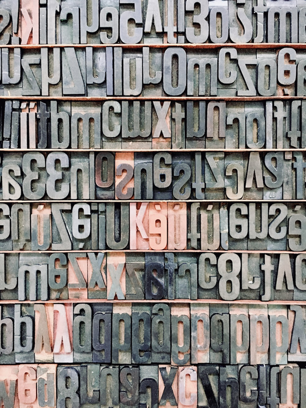
3.Fonts and Typography – These matter just as much as the rest of the design, maybe even more so. Typography is the visual placement of the words and how they are arranged. The fonts are the styles of the letters themselves.
If you are talking about graphic design, typography is the way that you design the typesetting. Read more about typography here. You want to arrange the type in such a way that it really makes sense, especially when you add in the right font. The letter spacing and line spacing need to be perfect for your design so that it is easy to read.
4.Composition is Important – The image should be in a way that makes visual sense. It should be visually appealing and in a way that has the different elements arranged proportionately. Your design is all about the proper composition.
Composition can be subjective, but there are still rules that you must follow – at least until you want to break the rules. You don’t want to have all the elements pushed together on one side and you don’t want them to be spread too far apart. If you aren’t careful, your t-shirt can give the reader the wrong idea.
5.Image Quality – If you are making the image yourself to give to the printer, make sure that the quality of the image is high. Many people will print off animagethat is in low resolution and it won’t translate well to a t-shirt. This means that the design won’t be as bright and vivid as you might want it to be.
Your print for your T-shirt will only be as good as the image that you presented the printer with. The image should be 200 dpi or more than that at full size. It would be better if it was up to 300 dpi so that your image will be even clearer.
6.Watch Your Colors –Colors are important, especially if you are doing screen printing. The more colors that you use, the more expensive the design gets. Screen printing can be better with a few solid colors and limited to other colors.
If you are printing direct to garment, or DTG, the amount of colors is no longer a cost consideration. This kind of printing is best for photographs that you are wanting to print onto a t-shirt. It will pick up all the gradiences that will make the picture look wonderful.
7.Contrast –Contrast is the difference between the lighter and darker parts of the image. It is also the way that the colors work with each other. The contrast can affect the way the image is seen on the t-shirt.
The higher the contrast of the design, the bolder it appears, and the lower the contrast the more subtle it will appear. The best contrast is white on black or black on white. Bright colors on a dark background will also stand out well.
8.Invert Negatives –If you don’t want to have your images looking like x-rays, you need to invert the negatives. This is especially important if you are printing on a black surface. You want the image outlined with a white line, as well.
It is often difficult to tell when an image needs to be inverted, at least for most people. What you need to look for are parts of the picture that need to be white – if it is black, it needs to be inverted. It really is just that simple.
9.Don’t Be Too Complex –The image needs to be kept simple without being too complex. You can’t take in too much information at once, so the design could be lost if you add too many things to it. It makes it easier to read and take in, especially when you are walking around wearing the design.
Sometimes people get carried away with the number of graphics that they want on the design. Sometimes it is the number of colors that are placed on the image. Either way, you just want to keep it simple.
10.Borders, Masks, and Edges – Using these items will help your design to stand out. You can use a mask feature to make the edges less defining. These features will help your design to look like it wasn’t just a picture that was printed on a shirt. It gives a little definition.
Conclusion
There are many elements to designing a t-shirt image. If you follow all the tips, you will have a perfect T-shirt design. This will help you to have the perfect T-shirt for whatever occasion that you are trying to memorialize.


